Fewer fatalities but not skidding fast enough
It always surprises me how the same stats create completely opposite reactions. For example as I was reading Wall Street Journal’s breakdown of “Safety Gains” and feeling good about it my wife exclaimed at seeing “Traffic Deaths Fall” in Saint Paul Pioneer Press that she could not believe that over 30,000 Americans died in 2013 from car crashes. I suppose the differing headlines were the main cause for the dissonance because after looking at the data her way I had to agree that it does remain appalling. WSJ homes in on a big drop in deaths of those driving new cars to 3.4 per 100,000 automobiles built in 2013—a third less than new vehicles in 2008. US Transportation Secretary attributes this largely to better stability controls that prevent cars from overturning.
On a related note, CarInsuranceComparison.com just came out with their latest Worst Drivers by State map. See here how Minnesota stands out in glorious green as the safest steerers in the whole country. Our main threat comes from roustabouts in Montana (tied for 1st of the worst states for bad drivers) barreling in from the east and convoying with the fellow fracking North Dakotans (4th on the hit list) for a blowout in the Twin Cities.
Buckle up, keep an eye out and drive carefully over the holidays so you do not add to the 2014 statistics. Also, ask Santa for a new car. That is your safest bet.
Pianogram of Piano Man
With its bizarre German-captioned photo of a full shopping cart cut in half, this literally off-the-wall Flowing Data blog on physical infographics got me going on displaying data using apropos figures or objects.
Just to show that it’s not just das deutchlanders who apply figures in clever ways see the clever “colour” matching guide inside this suckUKtm (!) tea mug.
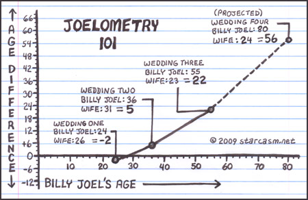
Further internet-searching on “infographics” brought me to these intriguing ‘pianograms’ including one, appropriately enough, of Piano Man by Billy Joel.
P.S. Coincidentally Billy Joel (not my cup of tea) just announced yesterday his return to Minneapolis for a concert, despite swearing off any further touring. Check out a wicked Starcastic graph of his many marriages and their progression toward younger and younger women. Then, to be fair, see this story about how Billy Joel’s three wives stole his heart and his money.
Choropleth maps—say what?
The mating of maps with statistics goes back to this 1826 graphic by mathematician Charles Dupin that illustrated the extent of illiteracy in France via regional shadings. Later these thematic plots came to be known as a “choropleth”—from the Greek for region (choro) and multitude (pleth). I only heard of this term this week, thanks to a Flowing Data blog by Nathan Yau with a tip on how to produce choropleth maps online.
Another variation on thematic maps is the “cartogram”—for example this one published yesterday by the Wall Street Journal that illustrates American unemployment. A cartogram shifts shapes so their areas correlate to some measure, in this case the relative density and number of workers. I am pleased to see on the last of the three figures that my home state of Minnesota fared well with its recovery from the Great Recession. However, I don’t like seeing our outline distorted so. The Dakotas and neighboring states really got squeezed. Perhaps we get some oil out of it to make our economy even better. ; )
Extreme brews and better ones that stay within more-reasonable limits
Posted by mark in pop, Uncategorized on October 26, 2014
While in Antwerp last week I sampled many good beers but none as good as the Trappist-brewed Orval pictured.

The locals love it so much that demand far exceeds supply from the ever-shrinking ranks of monks who brew it at the monks at the centuries-old Abbey of Notre Dame d’Orval. It is lip-smacking good, or as the Belgians in this Dutch-speaking region say—smakelijke.
On the flight home I watched several episodes of Brew Dogs, which features a pair of zany Scots who go for extreme craft beers. For example they took a blond Belgian ale and freeze distilled it many times to a level of 55 percent alcohol by volume (ABV)—a new record for beer. However even with it being infused with nettles from the Scottish Highlands and fresh juniper berries, this over-the-top brew must go well beyond the bounds of good taste.and … then put in a bottle created by a taxidermist.
A few years ago I headed over the border to Hudson, Wisconsin* to pick up a bottle of the then record-holder for ABV at a now-paltry 22 percent**—Dogfish Head’s World Wide Stout. With some coaching from my number one son, I poured it into a brandy-glass and sedately sipped it. I rate it zeer smakelijke. However, I am happy to go for far more reasonably high ABVs of 8 percent or so that come with tripel Belgian abbey ales. A few mugs of that provide a very good buzz. Proost!
*Many great beers do not achieve distribution in Minnesota due to liquor not being allowed for sale on Sundays and especially not growlers of craft-brews—all this being defeated again in May by State Senate. It seems that hell will freeze over and the Vikings will win the Superbowl before we can drink on Sundays. Until then it’s on Wisconsin.
**See this beer well down the BeerTutor.com list of strongest beers in the world.
Laws of nature lead to rare events that really ought not surprise anyone
Posted by mark in Consumer behavior on October 18, 2014
Years ago I traveled to Sweden intending to dig up some Anderson family roots. Although I had little luck tracing back the tree (too many sons of Anders!) it was great fun touring this Scandinavian country that seemed so much like home in Minnesota. One thing they had that we did not was a complete wooden warship—the Vasa —which sank on her maiden voyage due to some engineering issues (since then the Swedes have rebuilt their reputation!). After a dramatic movie-reenactment of this ship’s history, the lights came up and I discovered a dear friend of our family sitting right behind me. Unbeknownst to me they’d also gone for a holiday in Sweden, decided to go to the same museum, etc. Miraculous!
It turns out that from a strictly statistical view, coincidences like this really are not so unexpected. As physicist Freeman Dyson put it, “the paradoxical feature of the laws of probability is that they make unlikely events happen unexpectedly often.” A Cambridge mathematician laid this out in his eponymous Littlewood’s Law of Miracles, which states that in the course of any normal person’s life, miracles happen at a rate of roughly one per month. Dyson provided a simple proof of this law as follows. “During the time that we are awake and actively engaged in living our lives, roughly for eight hours each day, we see and hear things happening at a rate of about one per second. So the total number of events that happen to us is about thirty thousand per day, or about a million per month…The chance of a miracle is about one per million events. Therefore we should expect about one miracle to happen, on the average, every month.”*
I wrote all this about Dyson and Littlewood over ten years ago in my May 2004 DOE FAQ Alert ezine. What reminded me of it was this Science magazine review of a new book titled “The Improbability Principle, Why Coincidences, Miracles and Rare Events Happen Every Day” by Professor David Hand, former Chair in Statistics at Imperial College, London. It lays out these five laws that explain why seemingly rare events are really not that unusual.
None of this surprises me. In regards to the time I ran into a friend from Minnesota in Sweden, such encounters must be common that with so many of our inhabitants being of Scandinavian descent, most all of whom vacation in the summer, and go to the same popular attractions. How many of you have unexpectedly met someone you know while traveling far from home? I’d venture to say it’s the majority. That’s what these statisticians are trying to tell us. They really know how to take the excitement out of life. 😉
Japanese tribologists confirm that banana peels are slippery
We all know that banana peels are slippery, but who suspected this would be worthy of study. I suppose that given there’s a field of study (tribology) that focuses exclusively on the rubbing of surfaces, it stands to reason that the friction of fruits would come under scrutiny. The Japanese researchers who studied banana peels were singled out for an IgNobel prize for an achievement that made people “LAUGH, and then THINK.” It turns out that learning what makes these fruit coverings (aka “epicarps”) so slippery might lead to better lubrication of artificial joints.
It really is amazing how much a banana peel does to reduce friction. Check out the data shown in this report by Business Insider. As noted here in a Science News blog a floor littered with peels is not good for monkeying around, being nearly as slippery as ice, which us Minnesotans can readily appreciate. It would be funny, though, to see someone try this. Ha ha—someone already did as you can see in this Mythbuster’s clip of slips.
Online courses attracting cheaters?
According to the authors of the recently published statistical study “No More Excuses-Personality Traits and Academic Dishonesty in Online Courses” (Journal of Statistical Science and Application, V2 (2014) 111-118) cheaters now run rampant across most college campuses. With the number of undergrads taking classes online—4.3 million and growing fast, opportunities for academic dishonesty are expanding. Surprisingly, this experiment showed less cheating in the virtual than in the traditional classroom settings; indicative, perhaps, of those going online being more motivated to learn, rather than just achieving credits. This is good to see. Also, I was happy to learn that this and other similar studies found Americans being less accepting of cheaters and applying higher standards for honesty than most other nationalities. Along those lines, US News and World Reports in this June posting advises students to “Think Twice Before Cheating in Online Courses,” particularly when being proctored by webcam. The lady pictured with a cheat-sheet written on her arm might never get the chance to roll up a sleeve. That’s just too bad.
The most useless sports stat I’ve seen yet
When Minnesota Twin Trevor Plouffe came up to bat last night at Target Field they flashed this totally irrelevant stat up on the scoreboard: “Through July Plouffe is the only Major Leaguer to have at least 35 at bats vs 1 team.” I wondered how anyone can come up with such obscure information. This XKCD cartoon explains it.

Shocking research—young men prefer a jolt of electricity over doing nothing
Two-thirds of University of Virginia male students preferred a shock to doing nothing, whereas only one-quarter of the women did. This finding by psychologist Tim Wilson, which I read about in the Wall Street Journal,* does not surprise me in the least—young fellows always seek excitement that causes immediate pain or potential catastrophe for their life and limb. The more micromorts, equal to a one-in-a-million chance of death, the better, at least so far as men are concerned.
According to WSJ’s 7/18/14 article “Risk Is Never a Numbers Game,” micromorts (MM) were devised in the 1970’s by Stanford’s Ronald A. Howard to quantify the chances of death for any particular activity. Each day on average the typical American faces a 1.3 MM probability of a sudden end from external causes, that is, not a natural demise. The authors, Michael Blastland and David Spiegelhalter, bring up all sorts of morbid statistics. What interested me was not the murders and other deathly events brought on through little or no fault of the individual, but rather the discretionary doings such as horseback riding (~1 MM) and mountain climbing (12,000 MMs!). If you like heights but the latter sport exceeds your tolerance for risk, consider parachuting at a far safer level of 7 MMs or be really conservative by simply going on a roller coaster at 0.0015 MMs.
Whenever I see statistics like this, I wonder if one shouldn’t just strap on a helmet, grab a mattress, blanket and pillow, go down into the basement with the supplies left over from the millennium Armageddon and curl into the fetal position over in the southwest corner where tornadoes do the least damage. That being very boring, I’d first set up a battery with leads for giving myself a shock now and then.
How to weigh risks of medical tests and treatments
After suffering a heart attack in 2004, I was directed by my first cardiologist to go in annually for nuclear imaging. Test after test showed near normal function despite the noticeable but relatively minor muscle damage. My last scan in 2009 came back with a twist, though. The heart looked good but a white spot showed up in my chest that looked like a cancer. This necessitated me going in for a CT scan. It came back negative (no cancer). Nevertheless I spent a couple of weeks in a state of high suspense.
Now I’m undergoing underwriting for a key-man insurance policy for my company. Maybe I will need to go back in for another nuclear imaging. Although it will be useless to push back on this, my current cardiologist says there’s no need to spend the money and expose me to the radiation so long as I’m not exhibiting any changes in my heart health (I am not).
My point is that one should not assume that it’s always good to get testing, both because of its inherent dangers and because of the chance of false positive results—mistakes that can be very costly for the patients psyche. Also, the outright costs of over-testing cannot be overlooked. In this case I got irradiated two-fold by the nuclear imaging and then by the CT’s x-ray bombardment. (Is it irony that a test for cancer increases ones chance of cancer?)
My friend Rich put me on to this very-informative podcast by Minnesota Public Radio (MPR) featuring a talk, aired on June 30, by Dr. Jerome Goodman and his wife, Dr. Pamela Goodman on how to make medical decisions. Not only are both partners in this couple outstandingly qualified to speak on these matters, they bring quite different perspectives on how to weigh the risks of tests and treatments versus the potential benefits.
For example, a middle-aged woman is told that her cholesterol being above 200 exceeds the level considered safe for her heart-health. She is advised to go on statins to reduce the risk of heart attack by 30 percent. However, some research by this patient uncovers the statistic that women of this age only face a 1% risk of such a catastrophic event whereas 1 to 10% of those going on statins suffer the side-effect of myopathy—a painful and debilitating muscular disease. As a result of this woman doing her homework, she decides not to take the doctor’s advice. Does that make sense?
There really is no right answer for any of these medical decisions, but it surely is worth pressing your physician for data on risks versus benefits, doing your own research and, if it’s important enough, getting a second opinion.